By Manoj Sharma
Making a film is a task, and selling (read releasing) it is another. One of the first steps of a film’s publicity is making a relevant poster for it. In Memoirs of A Geisha, Mameha’s character says, “You cannot call yourself a true Geisha until you can stop a man in his tracks with a single look.” An appropriate poster titillates the audience in the same way.
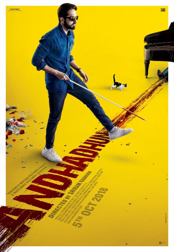
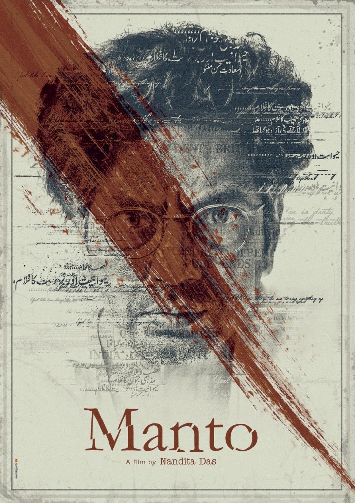
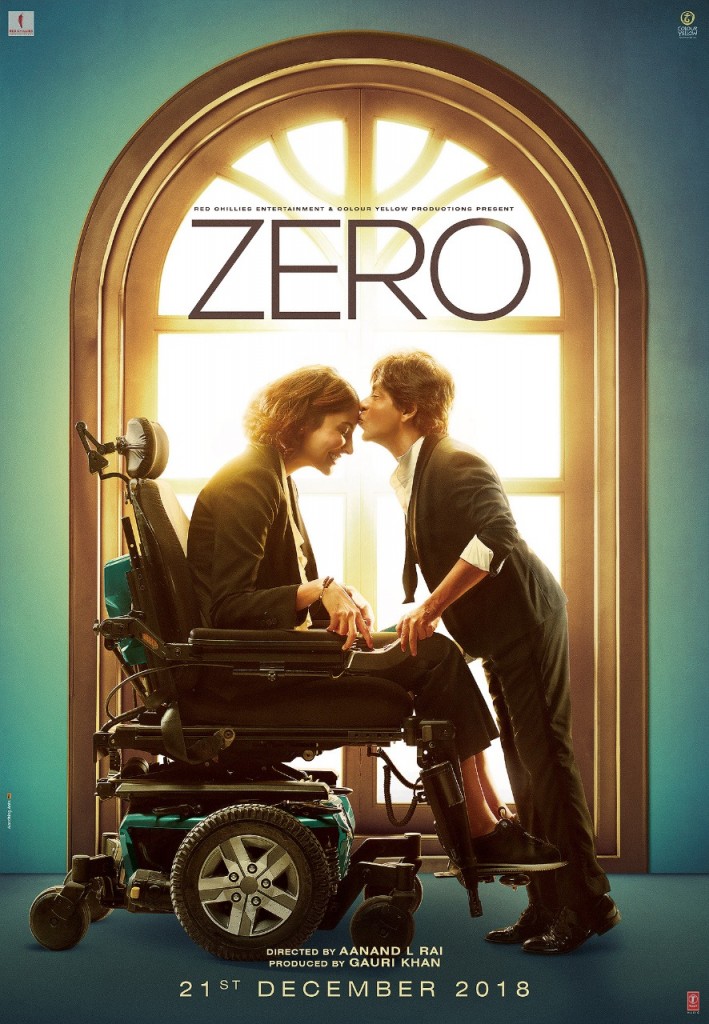
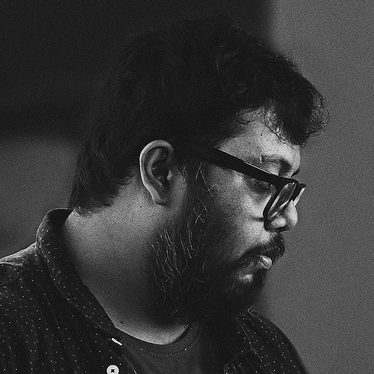
Raj Khatri knows all about design: of life, and the movies. Two of his Hindi-film key arts – Andhadhun and Manto – made it to Film Companion’s “Top 10 Movie Posters of 2018” list. We spoke at length with the ace poster designer and Creative Head at Marching Ants (India’s leading premium film marketing and designing agency) about his starting point, inspirations, innovative style, career and about the key to producing path-breaking design. For the uninitiated, his upcoming work: Shah Rukh Khan starrer Zero and Uri: The Surgical Strike.
How did poster designing start for you? What was the first film poster that you worked on?
RK: For this, we’ve got to roll back time to the early 80s. I was a kid in a boarding school hostel. I was extremely inclined towards the art of pop culture. Things like comic book covers, novel covers, toy packaging, video game covers, T.V. album covers, audio/video cassette covers and movie posters always fascinated me. There was a newspaper reading room in our hostel. The purpose of this room was to read the paper to improve our language. Except for me, everybody was interested in the sports page for the latest score. I used to religiously read the movie-listing page, because the black-and-white movie posters fascinated me. What interested me was how a small movie poster could generate such a huge amount of curiosity in a film. Back then, I didn’t know that it changed every Friday. So, I cultivated a habit of checking that page daily to look for new posters. The seed of my craft was sown right from these days. I didn’t know the name of this job, or whether it even existed at all. In a classroom scenario, if some decoration work, occasional drawing or diagram were to be done, I’d be the first one to volunteer. That was when I was in grade 3 or 4. Later on, during my college days, I started collecting audio cassette covers of international albums. I find album covers to be an art form in itself. In India, we just put the artist’s face over the cover and finish it. But in the West, their cover is a thematic representation of the album, supported with an imaginative layout or design.
I wanted to get into the J.J. School of Art, but couldn’t get through because my 12th Science cumulative score was less than 50 percent. So, I went on to choose Science as my graduation stream. But nothing made sense, and by the second year of my B.Sc. degree, I started sketching replicas of these album covers in my notebook. That’s when I understood my true calling. I quit my Science degree to learn how to design softwares like Photoshop, Illustrator, Flash and 3D Max full time. I would come home from my class and try to make posters of Hollywood films that I’d seen. The internet wasn’t readily accessible back then. So, I had my own method of making posters for these films. I used to rent video CDs from the parlour and took screen grabs from the film. By cutting images from these screenshots, I made my own posters in Photoshop. These were baby steps into poster designing. I bought second hand copies of Digit magazine to study from its Photoshop tutorials. I started my career as a web designer doing flash animation. I did that for two years, but all along I desperately wanted to get into film publicity.
This was a time when Marching Ants was just about breaking new ground. Their early works like Paap, Ek Hasina Thi, Lakshya, 36 China Town, Naach and Vastu Shastra were clutter breakers. They had a design and sensibility edge over other vendors who would just provide a floating edge sort of design. I applied for Marching Ants multiple times but didn’t get any response. Meanwhile, in 2005, I joined Epigram Advertising (another publicity and design company). I had applied to their web department (Websynergy, which later became movietalkies.com) as a designer, where they designed websites for films. It was a popular concept at the time. They used to translate the entire theme of the print campaign, and design an interactive website around it. It did fascinate me. After this I finally got into film publicity, which was their primary business. I had no clue about how things worked till then. I’d simply landed in the right place at the right time.
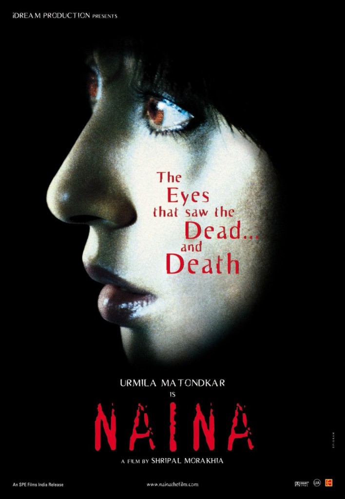
I still remember December 14th, 2004. Swades was releasing, and Epigram was finishing the last leg of film’s publicity. I was a big fan of Ashutosh Gowarikar because of Lagaan. Everybody was looking forward to his next film and the promos were on air. I met Nabeel Abbas sir (the owner of Epigram) and showed him my work. I don’t know what he saw in a kid who had no art degree and no experience of poster art. Maybe he saw my passion in posters. After a couple of questions, he gave me a job as a visualizer and on 2nd January 2005, I started my journey as a movie poster artist. My first poster: the horror film, Naina. It had Urmila Matondkar as the protagonist. Later I learned that it was a scene-by-scene remake of a Japanese film. Nonetheless, we’d worked very hard on it. In the pre-digital era, every photograph was developed from a transparency. The whole process was analog-based. Naina’s campaign was appreciated for its minimalism, cropping and composition.
How does the entire poster-designing process work? For a novice, could you chart it out – from rough work to software to execution?
It all starts with a brief. The brief can vary from project to project. It could range from a short synopsis, to a 4-5 page synopsis or if we are a little luckier, we get the entire bound script to read. Sometimes, if we are even luckier, we get to see the film or its rough cut. It gives us the idea of its feel, tone, milieu and setup. Sometimes we get a narration from the assistant director or the director. After we get a brief, our team brainstorms around the feedback we have from the client. A day or two of jamming. We come up with concepts. I have my concepts and my team has their own. Then we run it through our boss, Rajiv Chudasama sir (Creative Director and Founder of Marching Ants). And then collectively we decide the look, treatment, layout and title logo. Then we design the rough mock ups.
What are these mock ups?
Mock ups are refined digital sketches. For example, you want to design a poster where a guy is standing on a rooftop holding a gun. In an ideal scenario, we must sketch and send it. But most of the times the producers or the clients are not able to visualize how it will eventually look. So, we find a stock image from our library or from the internet. We take a reference image similar to the original idea and edit the image with logos and the environment around the image to make it an actual poster. This mock up is approximately 70 to 80 percent of how the final poster will look. For a film, we do around seven to eight mock ups. We explain to client these mock ups vis a vis its routes.
What kind of routes?
There are various approaches to a campaign. These approaches are the routes. Sometimes, one route will be very graphic. It will have a predominance of abstract shapes. While the other route could be very realistic. Other times, it could be just a treatment which is drastically different. We show the client at least two to three routes. Every route will have two to three creatives. When the client approves one of the routes, we come back and refine it. That is stretched out into a proper 6-7 poster campaign with a teaser and the first look. When it’s locked, we shoot with the actors using these as a visual reference. Using these professionally shot images and the stills from the film, we do the final posters. It goes for client approval, after which the final artwork and retouching is done. The next step is proofing, colour proofing, and then it goes for print and digital. That is the flowchart of the entire process.
Indian cinema is changing and so are the posters. Which old film posters do you still admire?
Oh, so many. I like the posters of Kala Pathhar with Mr. Bachchan’s screaming face. I also like the 70s-flower-power inspired poster for Bobby. This particular illustrated poster of Bobby has a hippie vibe to it and looks to be inspired from the Woodstock Music Festival of 70s. I love Guide‘s poster for its sheer simplicity of Mr. Dev Anand wrapped in a sheet. I like various posters for various reasons. I like the poster of Darr where three characters are painted in three different colours that are merging. Sunil Dutt Starrer Yeh Raaste hain Pyaar ke and Shammi Kapoor starrer Teesri Manzil are also fantastic ones where there is a lot of negative space in the posters. I like posters which are unusual and are not following the norm.
In India, the older posters were good, but in the western countries the work done was more exciting. Artists like Drew Struzan, John Alvin, Bob Peak, Saul Bass and Roger Kastel are legends in their own right. The work they were doing was leaps and bounds ahead of what was happening here. If you see Francis Ford Coppola’s Apocalypse Now poster, you can see how nuanced and beautiful the work was. Water pouring from Marlon Brando’s head and sun in the background. They were using scenes and shots from the films in posters, and we were mostly pasting head shots of lead actors. But our posters were hand painted, which brought a different texture and feel to it. But conceptually, the West was always ahead of us.
Did we lag behind because of the star culture?
India has always been a star-driven market. But in the west, they were doing both star-driven posters and concept-driven posters. They were even able to merge the two very well. You must see the poster of Deliverance done by Bill Gold. It’s a highly concept driven poster. Even their star driven posters were well finished. Here it was a rudimentary market where people looked only for star faces. But again, the hand painting had its own flavour which must be credited.
Off late you’ve experimented a lot with geometric shapes (especially circles). When did you start seeing cinema in these shapes?
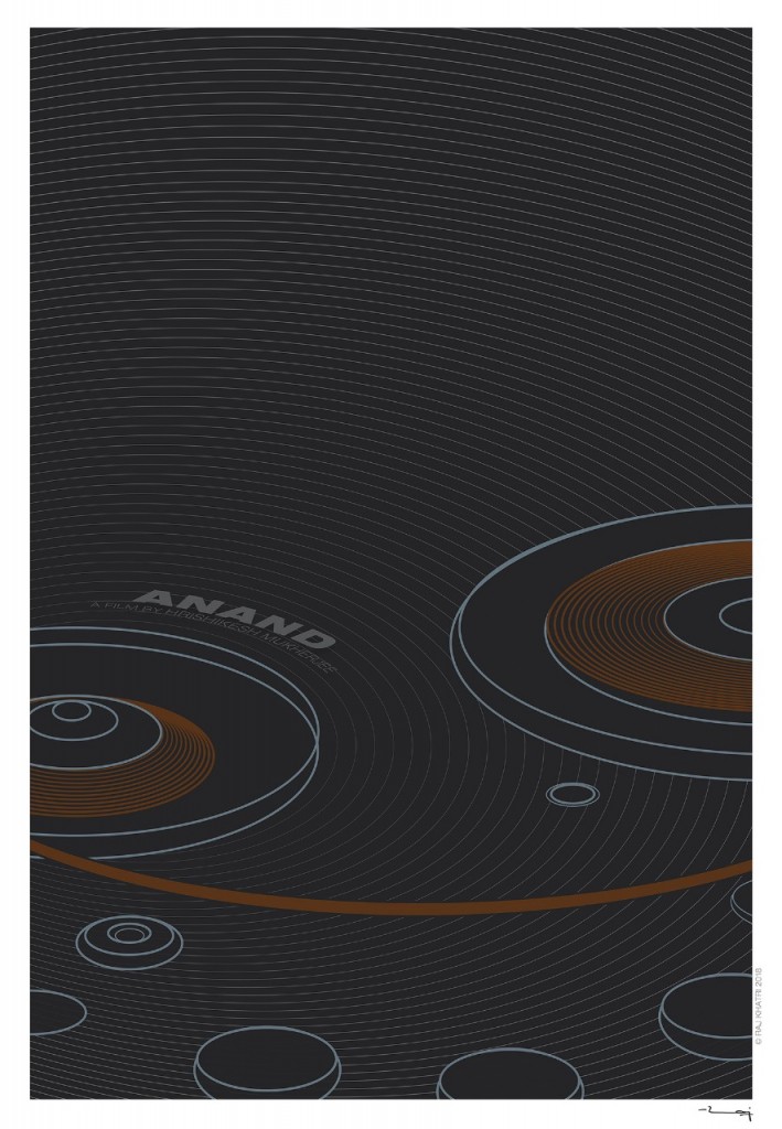
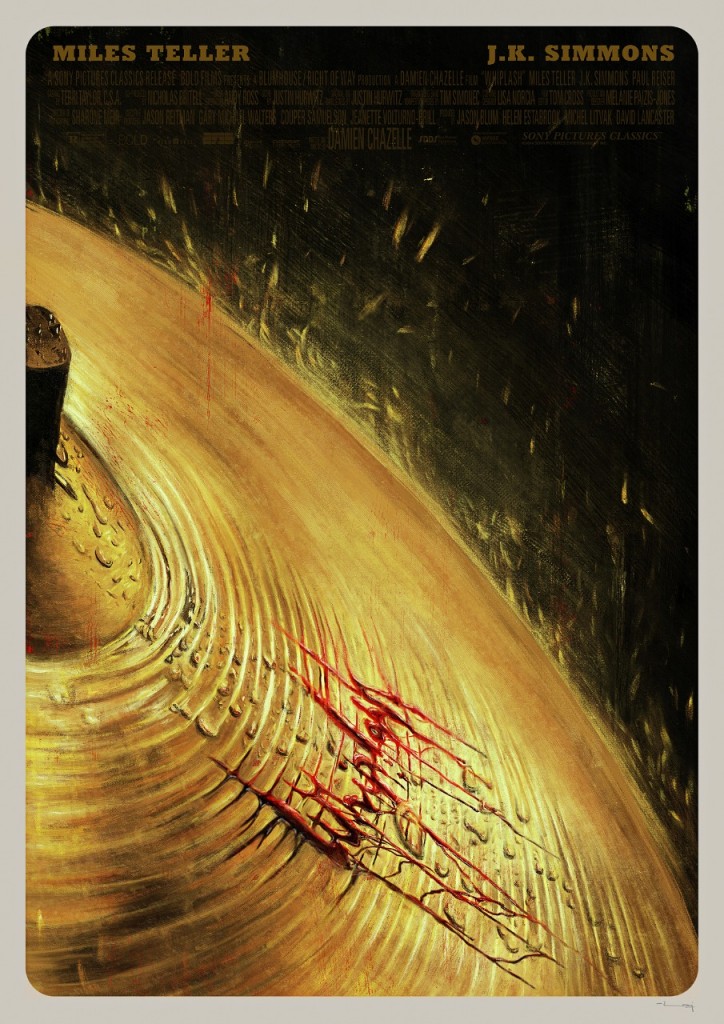
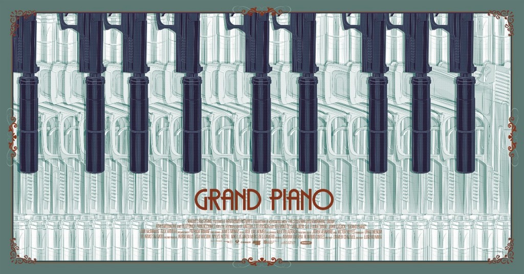
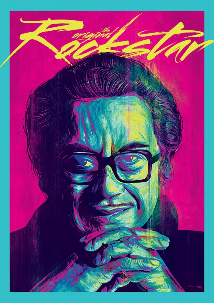
Not always. My mainstream work is different, and for the last 8 years I have been creating a parallel set of posters. These are personal projects. It’s my take on the things I don’t get to do because of the time restrictions of working in a commercial market. In my personal space I do illustrations, paintings and alternate posters. As we speak, there is a worldwide Alternate Poster Movement taking off in a big way. Fan art and tribute art is being done, and it has become an underground market as well. People are selling and buying such stuff. Even studios, producers and directors are commissioning it. All this gave me the inspiration to also venture into it as an aside. I started with basic portraits and illustrations of movie and television characters that I like. Then it led me to move into concept-driven work. Two years back, I did a mini-series of Hollywood movie posters that were depicted just by colour strokes. If one doesn’t know the name of the film then it’ll seem like an abstract art piece. But the moment one sees it with film’s name it makes total sense. This series went viral, and many international magazines and blogs published it. Last year, I got motivated to do a similar thing around Hindi films but not with colour strokes. That’s when I thought: how about depicting these films in just circles? It took 3-4 months of work to develop these images.
You also take poster designing workshops now. What are the FAQs from aspiring designers?
The most frequent question I get is, “How much money can I earn with this job?” I tell them that if you want money and fame then this is not the profession. It’s a behind-the-curtain job. Meant only for people with driving passion for this art form. When a poster releases it gets archived and becomes a part of the film memorabilia and pop culture. That’s the incentive we work for.
Another question is, “What software you use?” I use Photoshop, Illustrator, Cinema 4D or 3D applications. Other questions: what is the timeline involved? How long does it take to do a poster? What is the process? Who gives you the images for posters? Do you meet the actors?
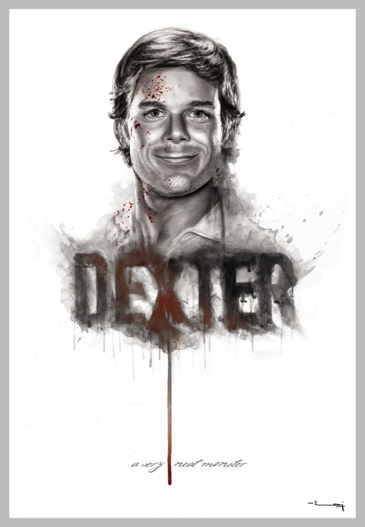
Talking of timelines, what is the shortest deadline that you’ve worked on?
It varies from project to project. The maximum pressure occurs during the first phase of pitching. Sometimes, there is just one night to work on and present the idea. In luckier cases, we get a week to work on a fleshed-out campaign.
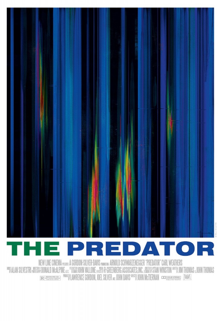
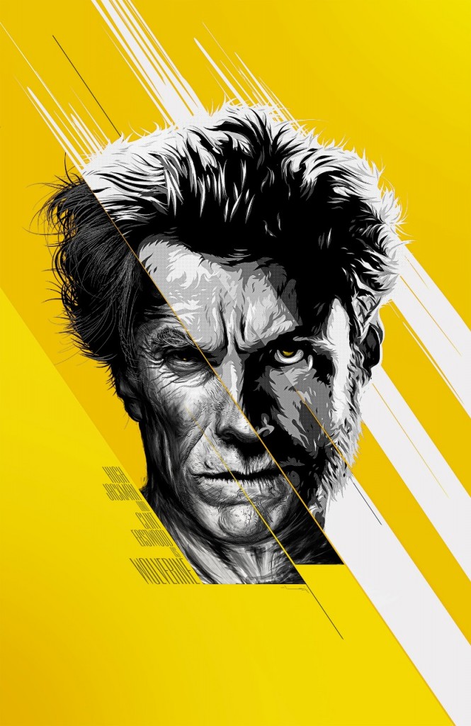
Which Indian and International poster designers’ work do you like?
Frankly, in India I don’t see much exciting work. It’s why I feel a bit disheartened. Due to a lot of plagiarized work hovering about in our market, people don’t take the Indian poster industry very seriously. Because of this, the profession as a whole doesn’t get its due credit. Often, the plagiarism is client-infused. Plus, there are so many badly done posters whose design and finishing is poor. Understandably, Indian poster art work doesn’t inspire me as much. It always gives me a reason to do better and hopefully inspire more people to push the envelope more.
Still there are very few designers who are trying to do new things. Vinci Raj, John Tuney (24am), Old Monk designs from the South Indian industry, Grinning Tree designs from Kolkata, Ankur Patar from Punjab and Swapnil Rane (Brain on Rent advertising) are the ones doing good work.
Internationally, there are many independent artists and studios whose work I look forward to. B.L.T and associates are the baaps of movie poster designing. Then there are studios like Concept Arts and Refinery. Independent artists like Jeremy Saunders from Australia and British artist Scott Woolston are doing great work. And I always like to look at the work of the old daddies that I mentioned earlier. The work of Alternate Poster Artists like Doaly, Greg Ruth, Gabz, Martin Asin, James Edmiston is exciting. Then there are modern day legends like Sam Spratt, Laurent Durieux, Kim Jung Guis, who are all awe inspiring. There are many comic book artists and concept artists that I follow. Ryan Mendering’s work for MCU movies is just spectacular. Lee Bermejo and his high-contrast super-intricate dynamic designs for Batman and Joker is just pure passion at display. Poland is producing some crazy artists in recent years, like Grzegorz Domaradzki, Tomasz Opasinski and Peter Jaworowski. Watching these greats pushes me to create something out of those sleepless nights.
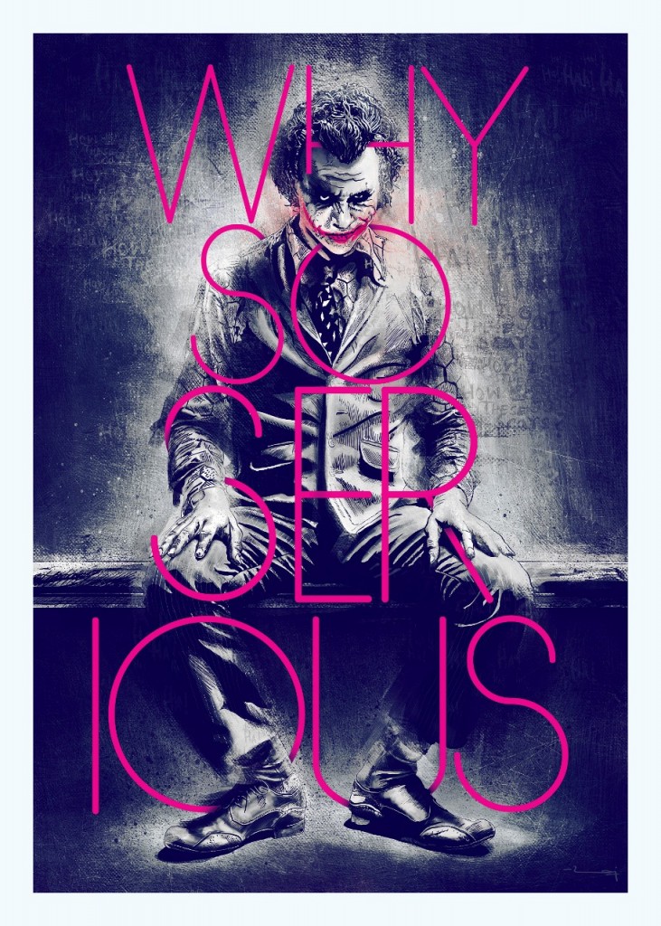
Quirk is a norm in your work.
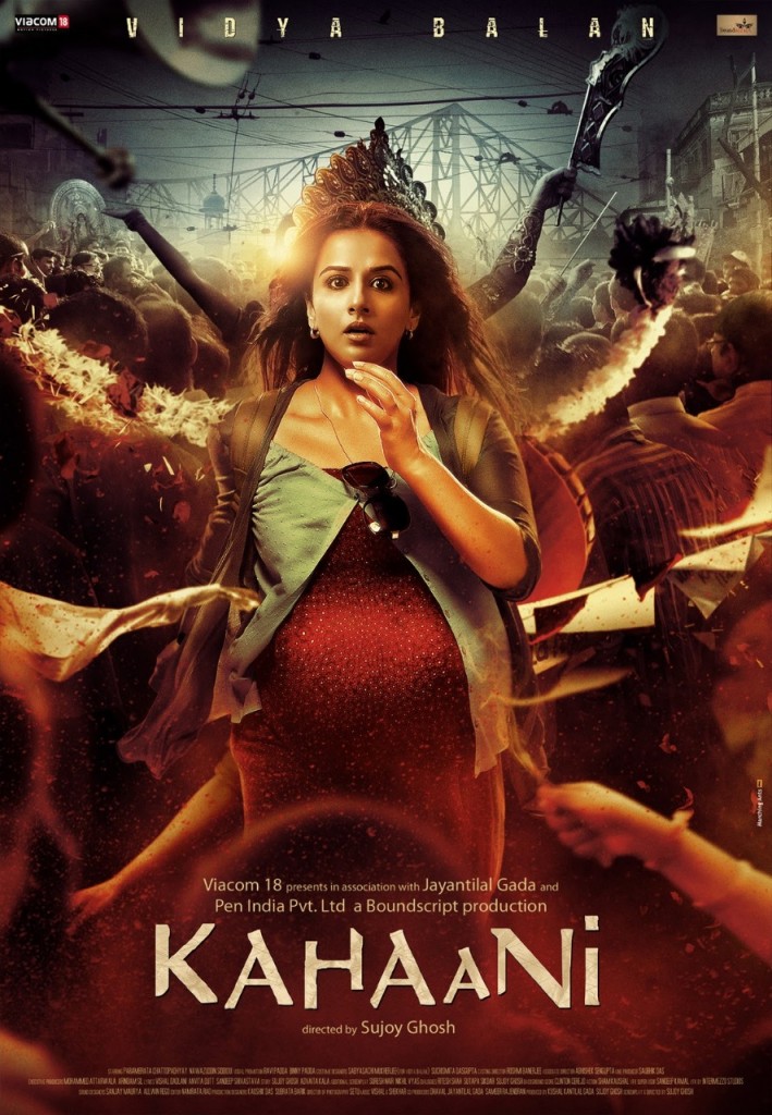
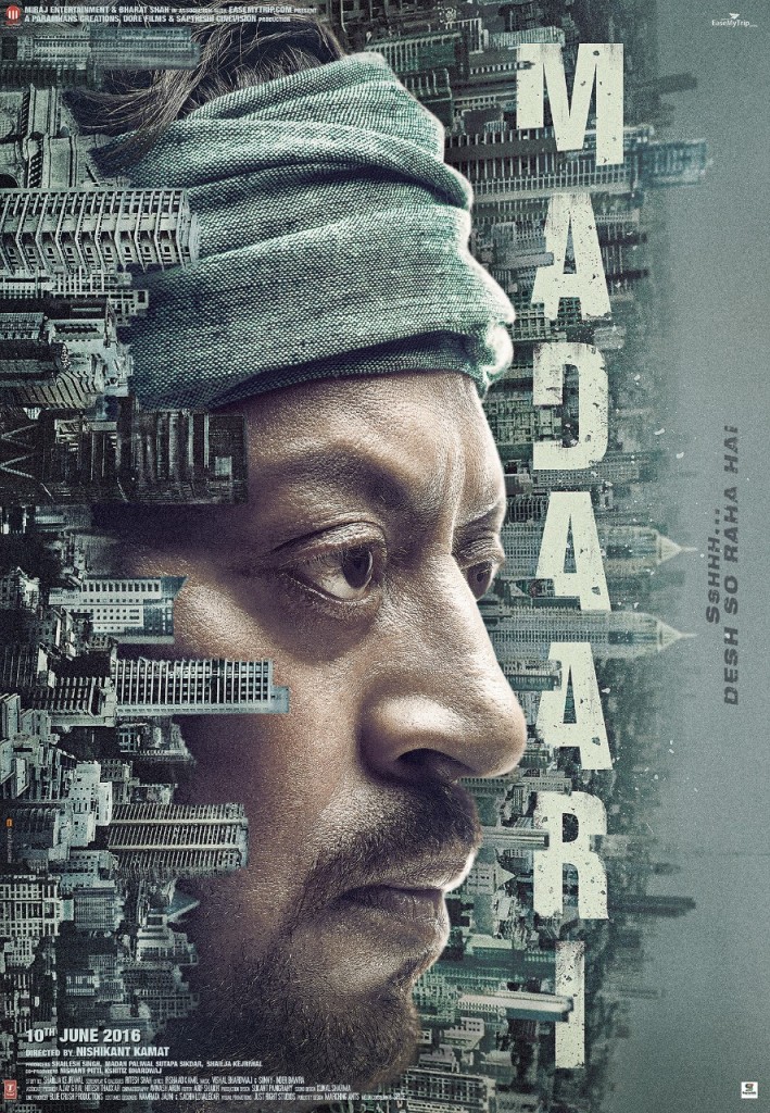
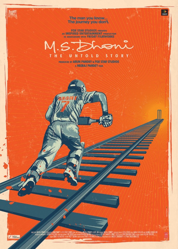
I call it a “twist in the tale”. If the audience can remember a poster beyond its movie actors, then I’ve done my work. If movie actors are remembered out of a poster, it means they are selling the film. In that case, anybody can paste their faces, photoshop a bit and the poster is ready. People do remember well-made posters in terms of treatment, style, concept or that twist. The audience even remembers them far after the films are gone. My work for movies like Shor in the City, Madaari, Kahaani, Manto, Andhadhun will hopefully be remembered even after the years go by. I just want to keep delivering that twist and be remembered for my work.
[To enjoy Raj Khatri’s complete set of work, log onto his Behance URL here]




Leave A Comment
You must be logged in to post a comment.