By Kabeer Khurana
“Cinema isn’t made in a vacuum,” an eminent Indian filmmaker once told me. A realist and an academic, he was right in his own way. But coming from an animation grounding, with an extremely visual storytelling style, I have always been fascinated by the power of cinema to create self-contained worlds that push the boundaries of our imagination.
In the Indian context, the government-aided film school training is more cerebral and akin to an academic course in the humanities, where film aesthetics and art is put on a side-burner. This is also perhaps because in our current political scenario, it is far more important for Indian filmmakers to make a point through their films, than tell an endearing story with spellbinding visuals. This, I believe, is the reason why Indian cinema is languishing, and is stuck in a bizarre binary – on one hand, we have the “art-house” filmmakers who care less about the visuals than about posing a political question, and on the other, the “commercial” filmmakers who do pay heed to the visuals, but the aesthetics are usually cliché, gaudy, and don’t help in propelling the story forward. There are exceptions to this binary of course, but this is largely how I see it: Very few Indian filmmakers have been able to find a distinct visual language that they can succinctly be recognised by, and by fact, we’re stuck in a kind of loop in terms of the kinds of films we’re making.
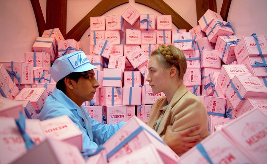
As a filmmaker myself and as far as my understanding is concerned, I truly believe that while making a point through cinema is important, a design and animation understanding/style is equally important to be able to tell a story that can touch, move and inspire. Many filmmakers and film academics who think extremely critically when making their films, forget to think laterally to make their stories more engaging and inspiring. In fact, I truly believe that about the main characteristics of a great filmmaker lies in their ability to capture humanity in the artifice of the constructed and imaginary world: that is, the ability to strike a balance between aesthetic stylization and political relevance. Think of Wes Anderson or Tim Burton for instance – they’ve got a distinct signature etched across their work, with a style magical and other-worldly, and yet their films chronicle our times, are grounded with a sense of reality, and address very relevant humankind problems. It’s a perfect equanimity, which I see very rarely in the Indian context.
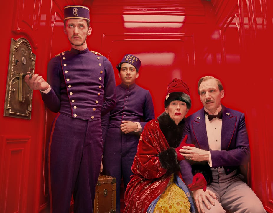 Wes Anderson’s The Grand Budapest Hotel
Wolfgang and Christoph Lauenstein’s surrealist short film, Balance (1989), is probably a great example of a high-concept communicated through a great design and visual sensibility. While I can imagine a filmmaker from a non-design/animation background to communicate the same concept through either a documentary or a highly verbose narrative format, being from the School of Fine Arts in Germany, Christoph cleverly employed certain design tools and visual motifs to tell his story through symbolism. When I saw the film a few years ago, it got my mind stirring – why should the Academy Awards really have a separate category for Best Animation film? Shouldn’t some form of animation understanding and design thinking be a part of every film in order to make our storytelling richer? Incidentally, the balance that the film speaks about is also similar to the kind that I’m referring to –between visual literacy and visual manipulation. While visual literacy is based on the notion that visual communication and cinematic storytelling depends on the syntactic and semantic conventions of the written language, visual manipulation pursues the idea that a lot of high-concepts can be communicated through colours, design and visual abstraction alone.
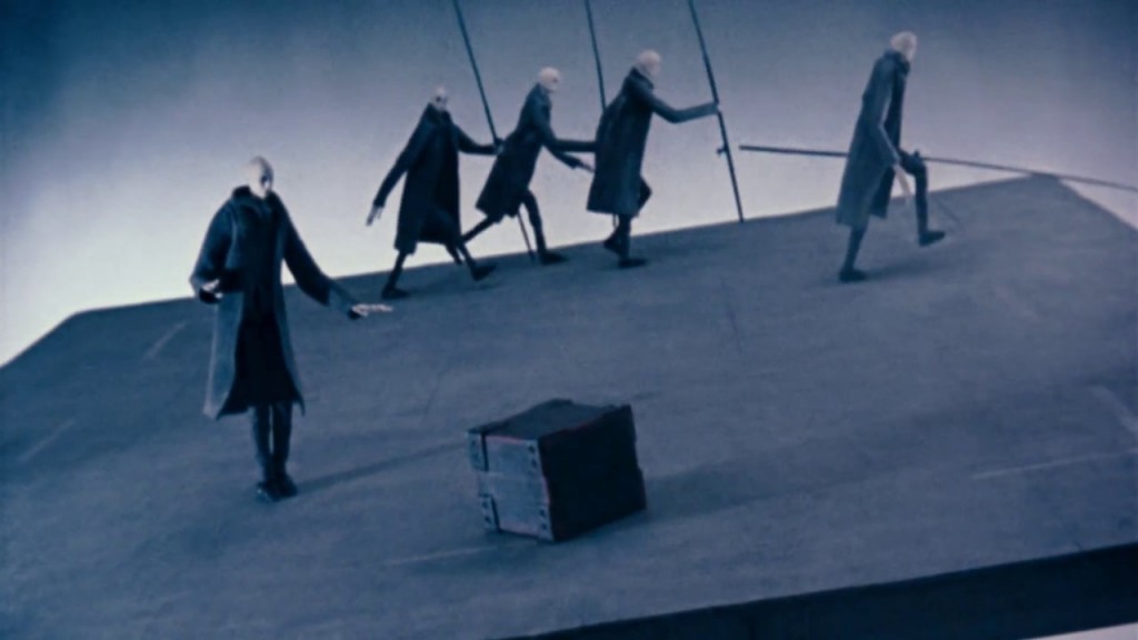 Balance
A lot of filmmaking is about knowing when and where to break tacit conventions. Speaking of the use of colours in cinema, I do not mean usage of colours purely as eye candy (the kind we see in typical commercial Bollywood films), but rather the meaningful, understated and sensitive use of colour to manipulate the mood and emotion of the scene as perceived by the audience. The use of colour is as much of a psychological art as an intuitive gut feeling of knowing what works. Colours have the power to simplify complex stories, replacing dialogues with just visual cues. For instance, the use of colour in Melies’s A Trip to the Moon makes it look fantastical, D.W. Griffith used colour in Intolerance (1916) to distinguish the time periods of his four storylines, and closer home, Mani Ratnam gave Indian cinema a path-breaking visual language through the use of visual metaphors, and the evocative use of colour, in Kannathil Muthamittal (2002). In fact, I’m even more surprised that there isn’t an Academy Award for Best Colour yet. Although good use of colour and composition doesn’t strike immediately, and isn’t overt, it’s clearly one of the key elements used to propel and convey the plot. In a very subliminal way, colour works on our minds, and even more so on our hearts.
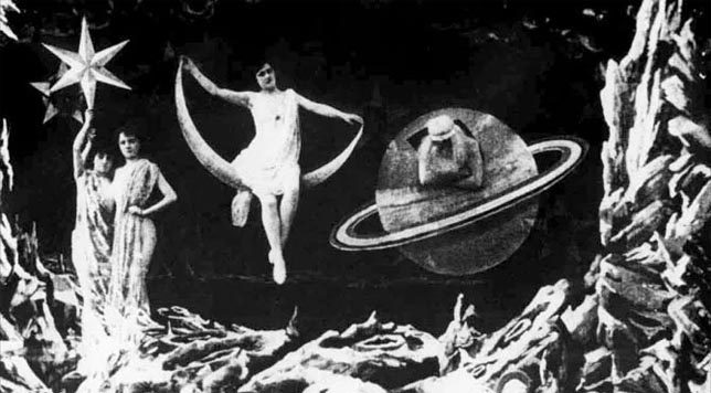 A Trip to the Moon
Flashback: Wedged and scathed in the chasm of an imaginary faraway land, the journey to Jammu was an inexplicable multitude of emotions, a realization of the paradigms that can be created through the power of cinema. I was probably fifteen at the time, and Wes Anderson’s Moonrise Kingdom had me absolutely mesmerized at the kind of mood and emotion that can be created by visuals, colours and composition alone. Mind stirred, it was at the time that I realised that a lot can be said by not saying too much, and by solely exploiting the show-and-tell format of cinema. This, somewhere, seeped into my narrative style as well. Working on a concept film called ism (2016) soon after, I was very clear that I wanted to get my point across in a very visual style, as oppose to a documentary format, which at the time, seemed like the appropriate format for the kind of film it was.
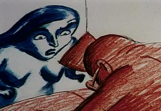 Repete
A silent Czech animation film called Repete (1995), inspired me to give the film a ‘narrative design.’ Repete was about a repeated tension in our relationships throughout our lives, with characters constantly on the run every single day, stuck in an endless marathon, doing the same tasks every day, dealing with the very same struggles that relationships entail. The entire stylization and music of Repete, inspired me give a rhythm, design and musicality to ism, with the use of swish pans, quick cuts, visual symbolism, motifs and an animated characterization, making the storytelling richer, crisper and far far more visual. Ism, for me, was a creative process that made me understand what I’d like to call as ‘narrative design’ – an ability to move beyond the conventional over-shoulder and objective shots, to tell stories through a series of abstract aesthetic visuals, with minimal dialogues.
There is no such thing as a poor story, there’s only poor storytelling. In a race to be thematically and conceptually unique, we forget that design and visual understanding is what propels us to tell better and more powerful stories, in a lucid manner. Growing up on Norman McLaren, Winsor McCay, Lotte Reiniger and the likes, and working on a slew of highly concept-driven films in the past three years, I have always ensured that the communication of the controlling idea was more of a design process, and less of heavy verbal communication or documentation. As is the case with Repete, Balance, and a bunch of other concept films made at the National Film Board of Canada (NFB), I’ve noticed that a certain stylization in the narration really amplifies the impact of the idea, making the film far more engaging and memorable. An animation, design and fine art understanding in live-action cinema helps create worlds, communicate emotions and simplify ideas and complex stories.
Imagination and creativity aren’t just important in conceiving a story, but also in the format and style of storytelling. Think different.
Watch the author’s short film Religion for Dummies here:
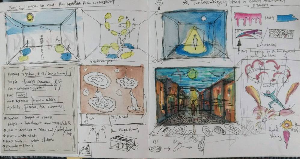
Concept Art for the film:




Leave A Comment
You must be logged in to post a comment.